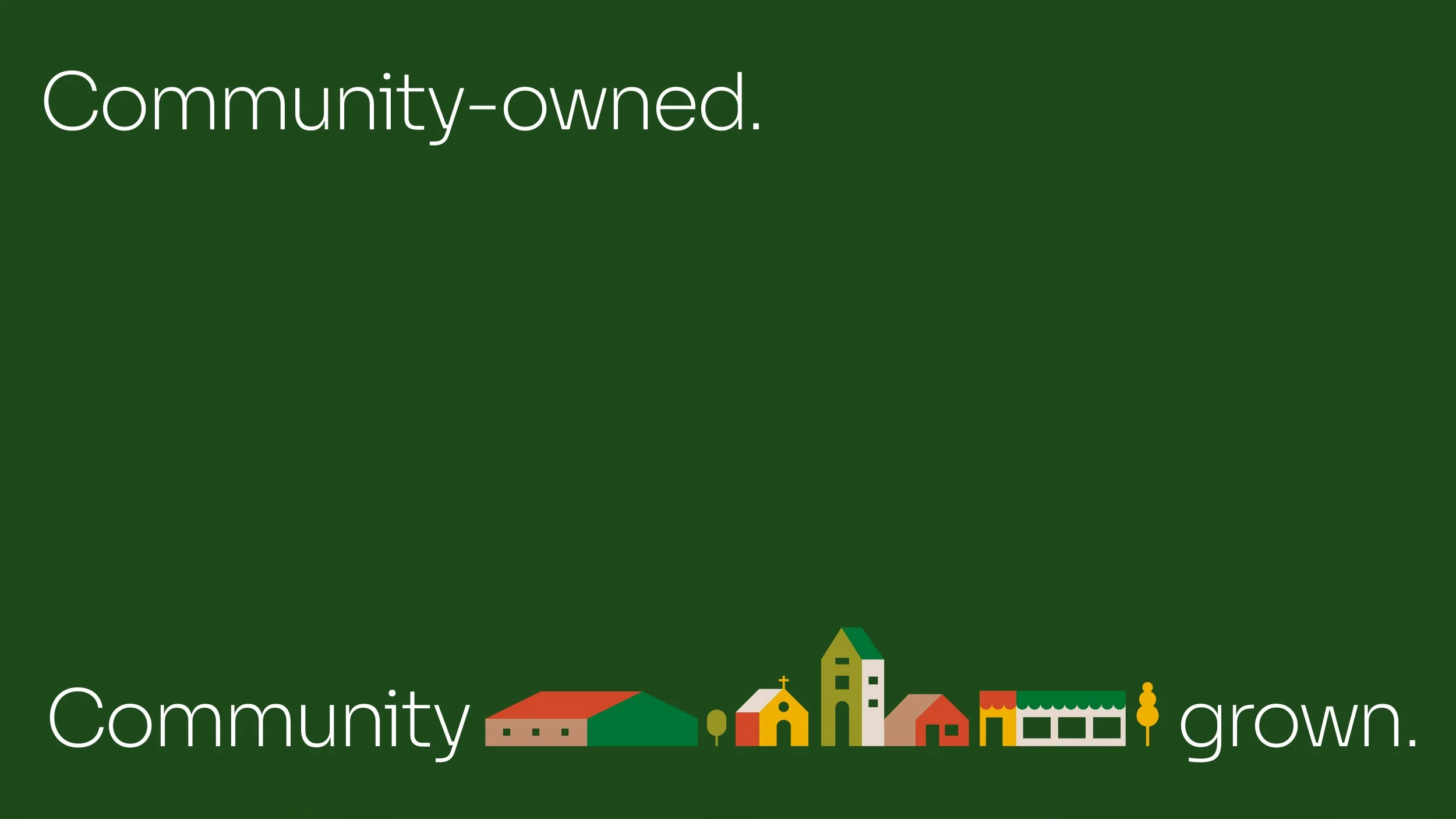
Community-owned, community grown
—
Plunkett UK
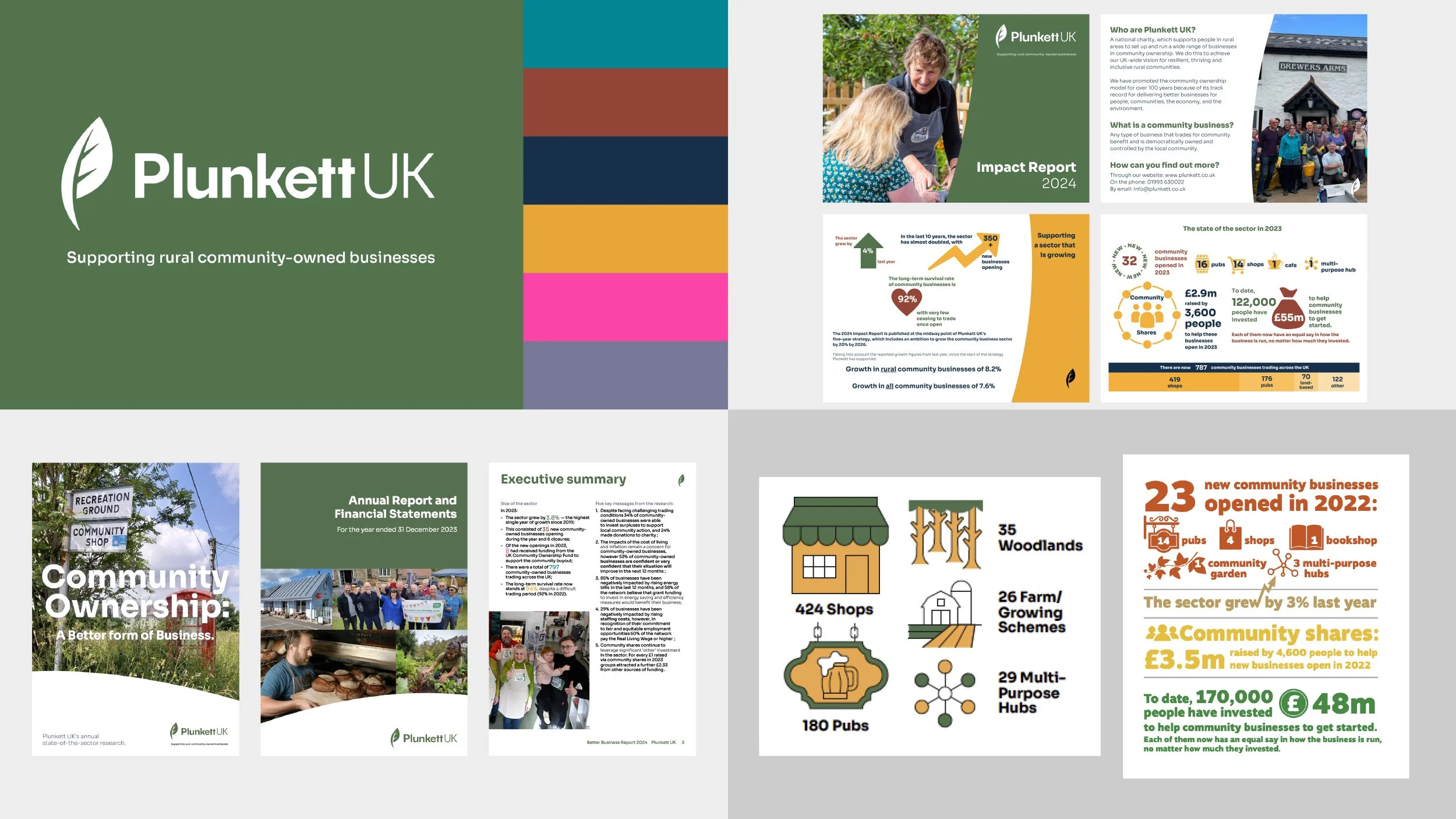
Plunkett UK is a national charity that supports people in rural areas to set up and run a wide range of community-owned businesses. Its work is powerful and practical. Its brand was not. Communications felt dated and inconsistent, with weak positioning and a design system that did not reflect the warmth, credibility or ambition of the organisation.
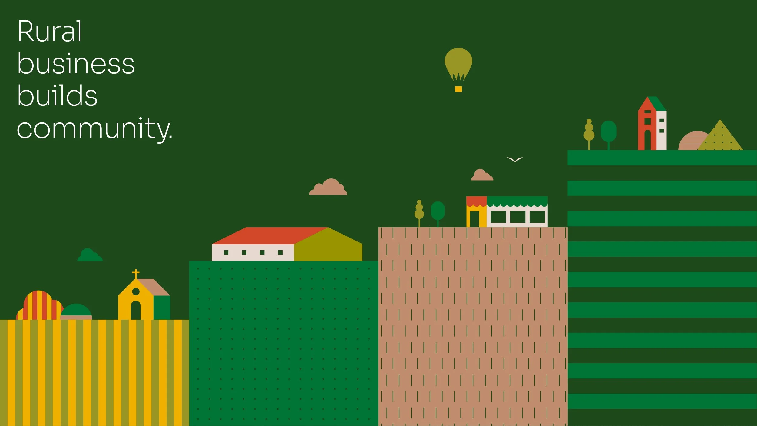
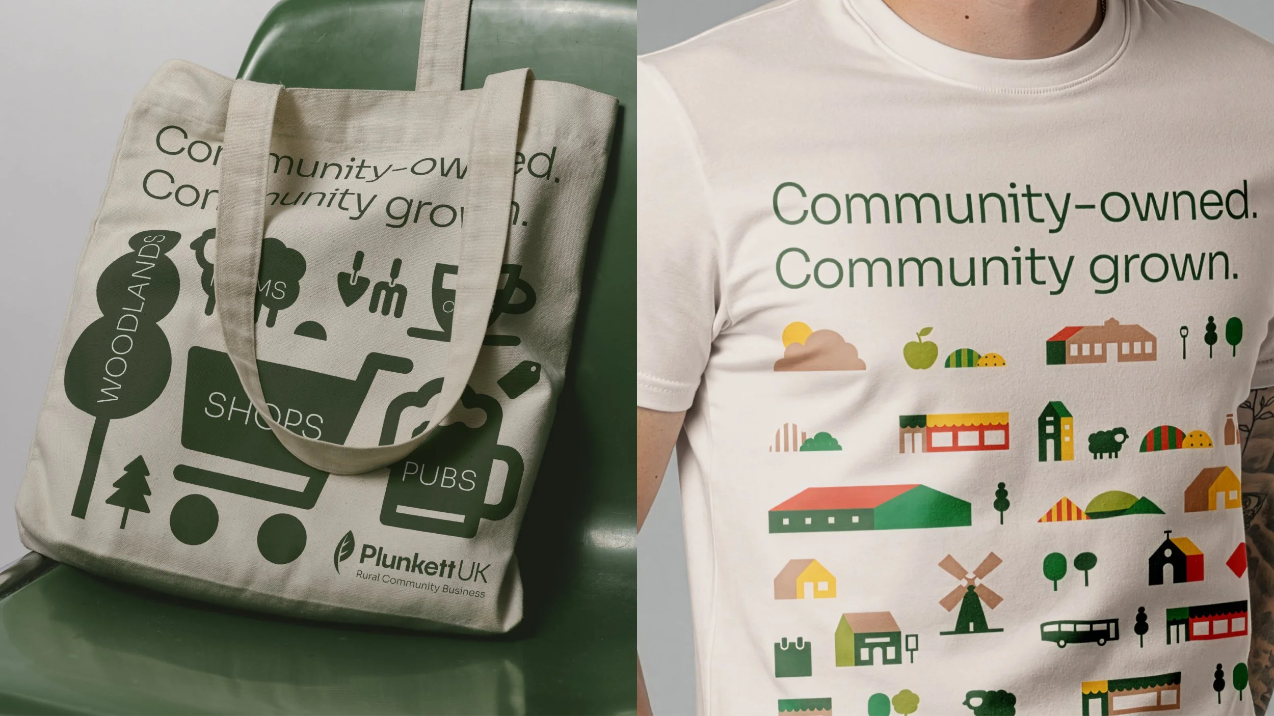
The rebrand is built around the belief Community-owned. Community grown. It gives Plunkett a more emotive and memorable way to express its purpose. Keeping its recognisable logo, we created a clearer, more confident brand that respected the equity of the original identity, refining it into a more coherent and useful system.
Disciplines:
Brand Strategy
Creative Direction
Art Direction
Creative Execution
Illustration
Client:
Plunkett
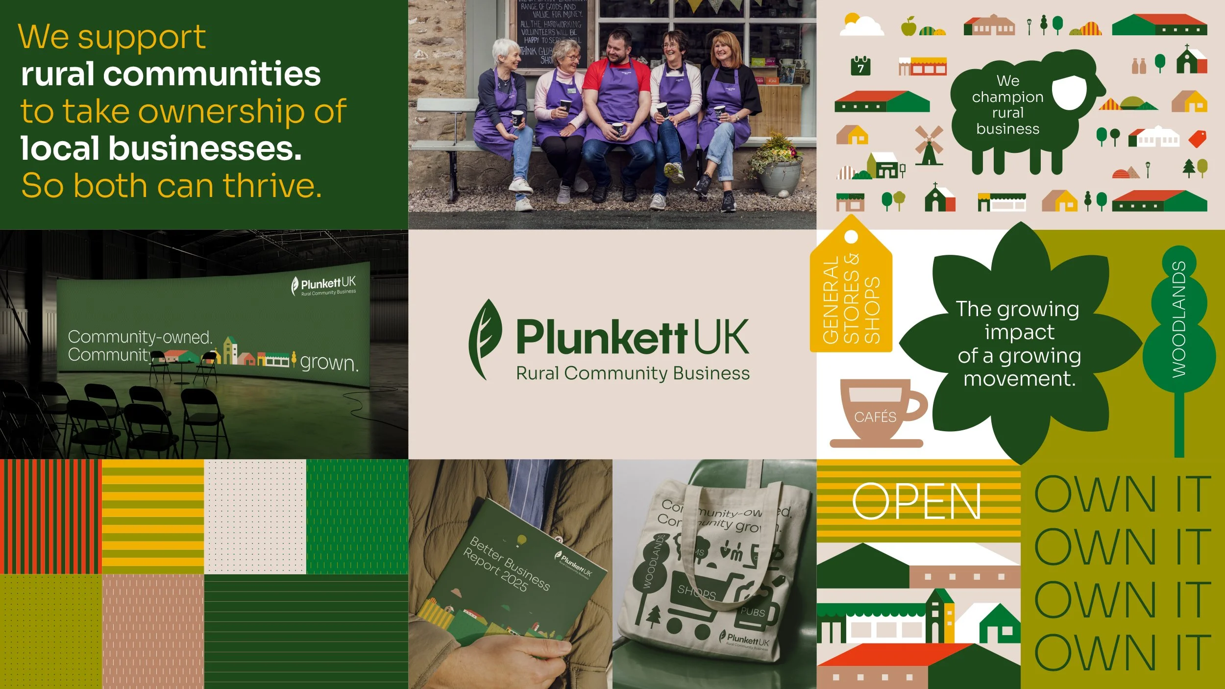
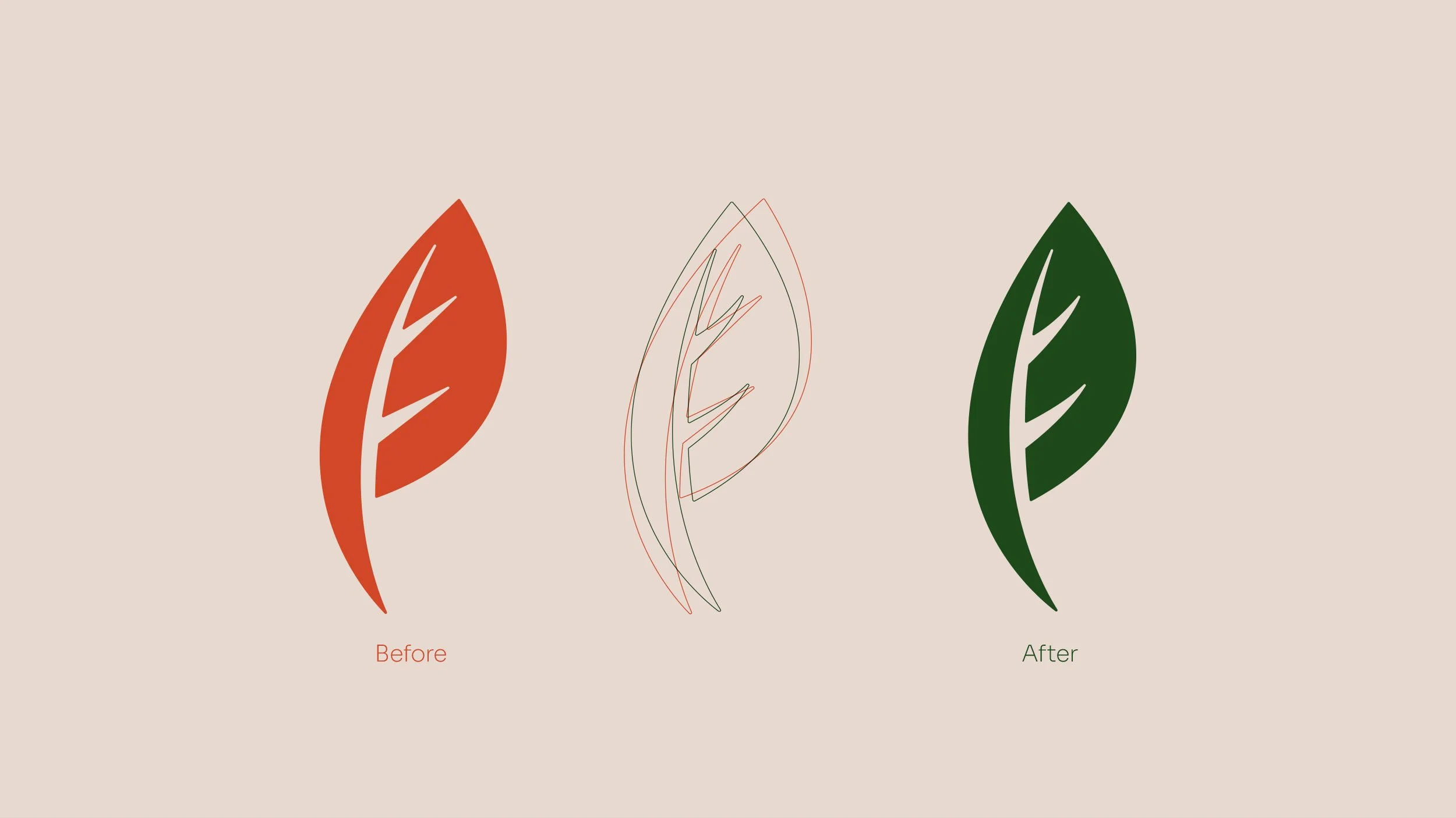
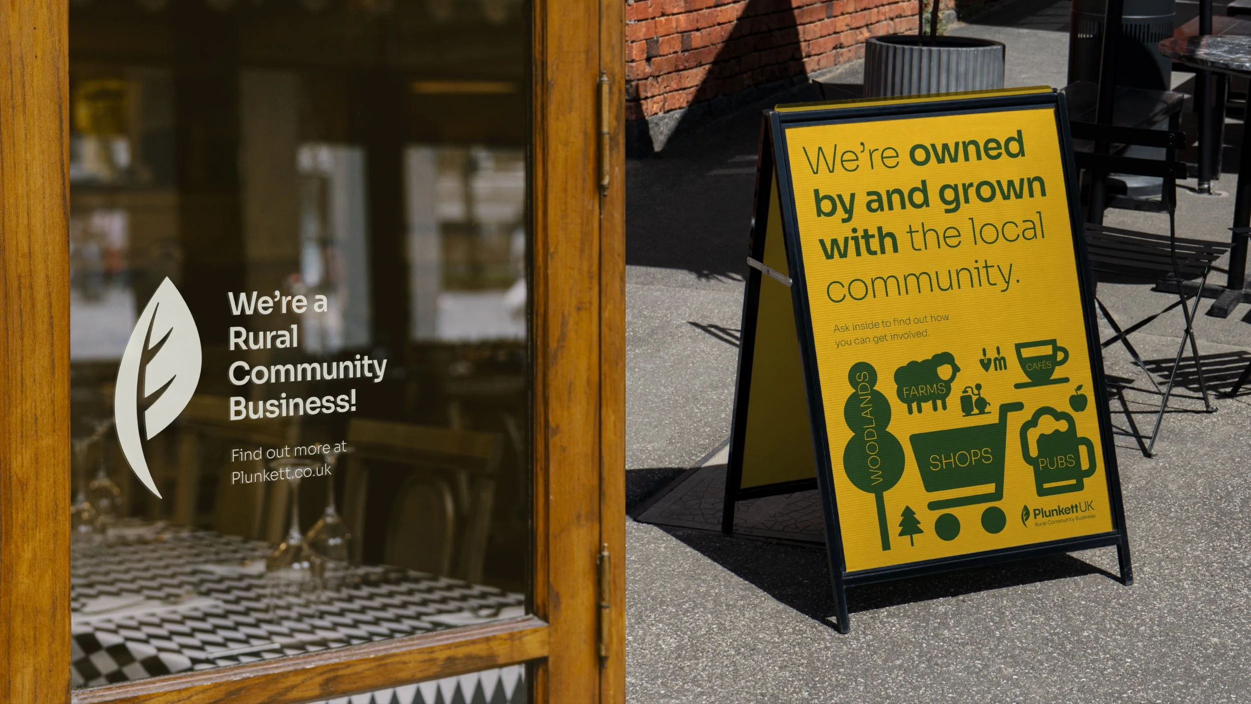
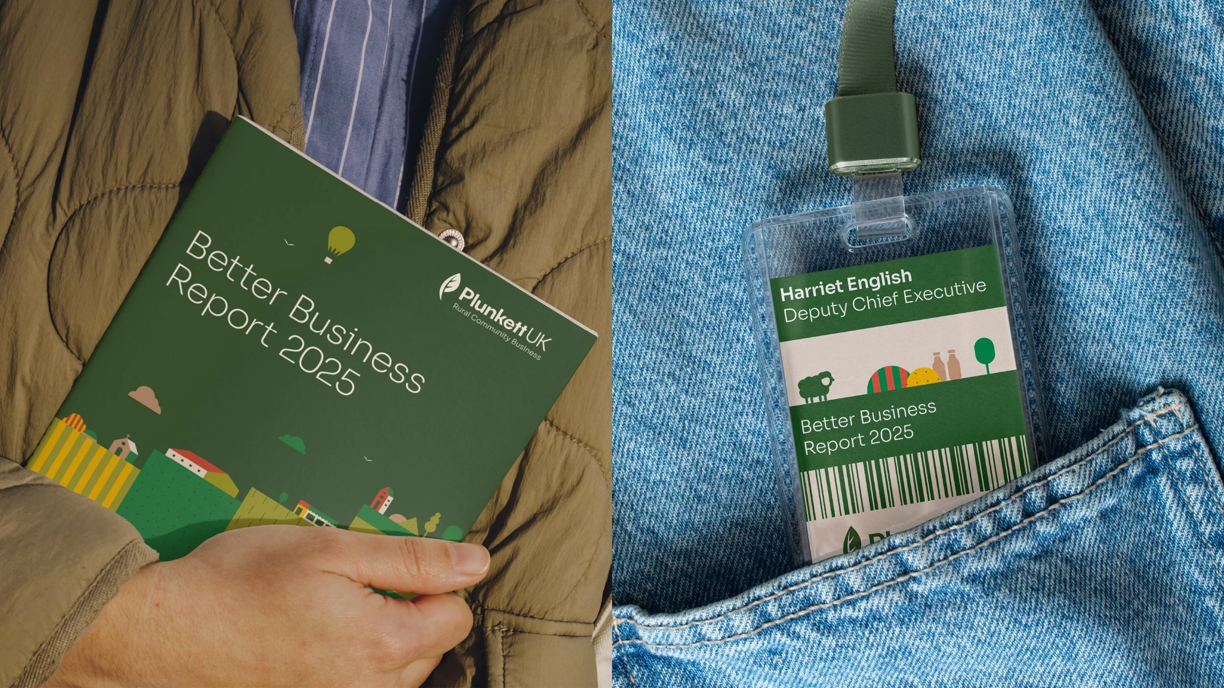
We defined the space Plunkett operates in more clearly with the descriptor Rural Community Business, developed a cleaner logo lock-up and subtly evolved the leaf marque to feel softer and friendlier. We also refined the typography, keeping the same font but moving away from bold caps and heavier weights to create a more professional and approachable feel.
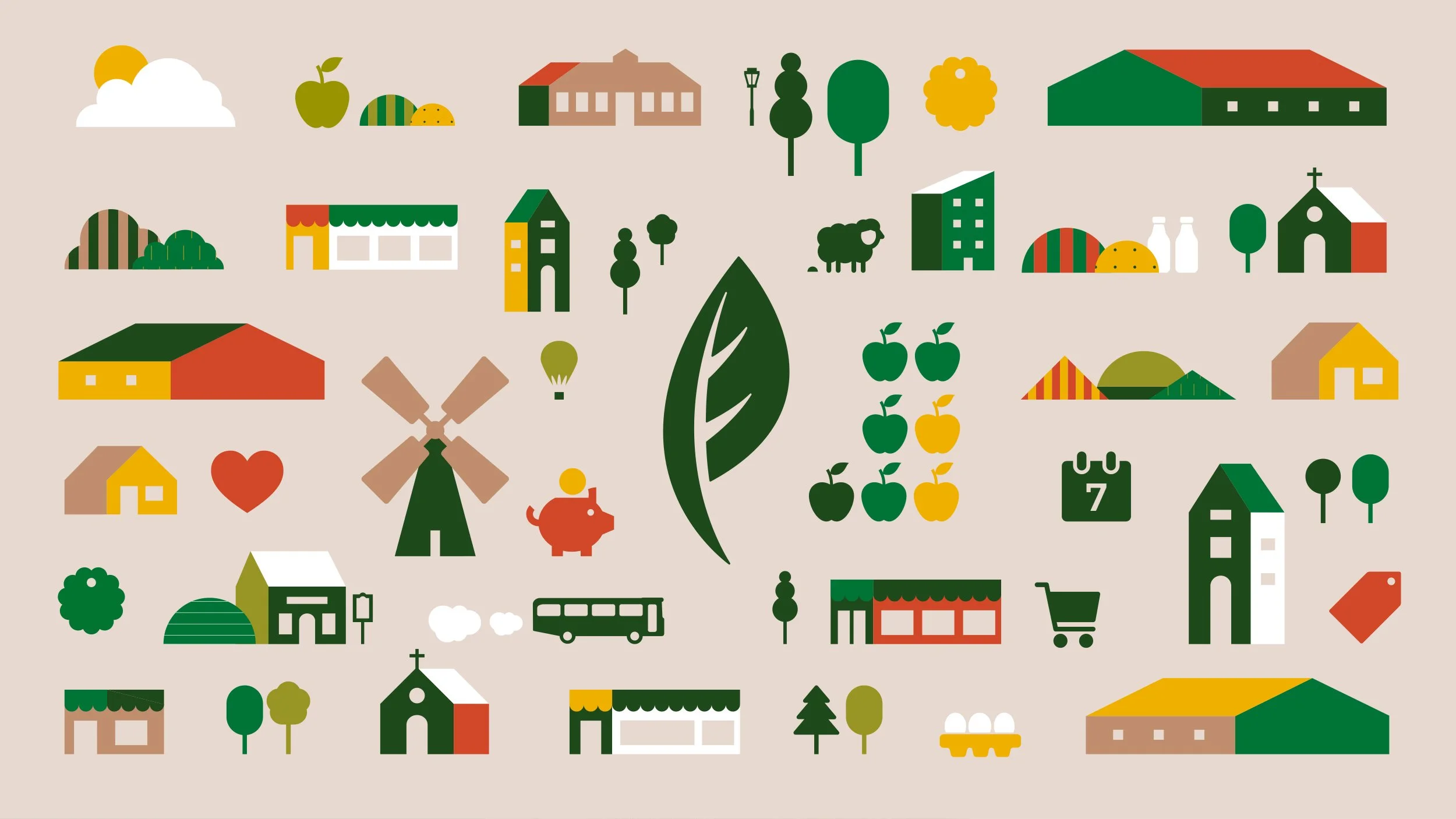
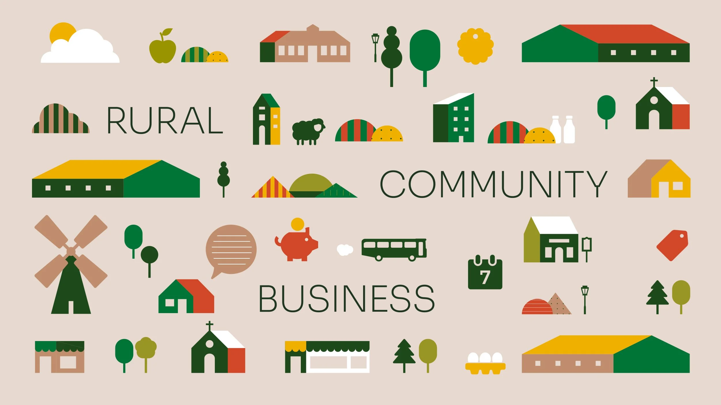
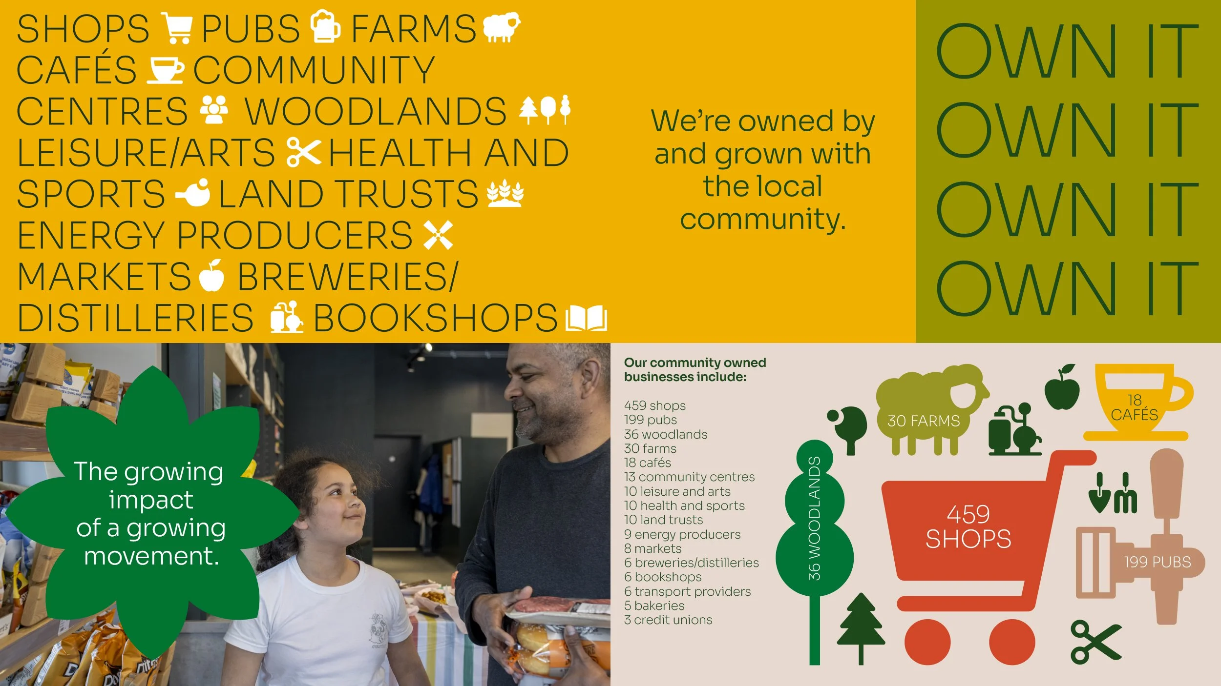
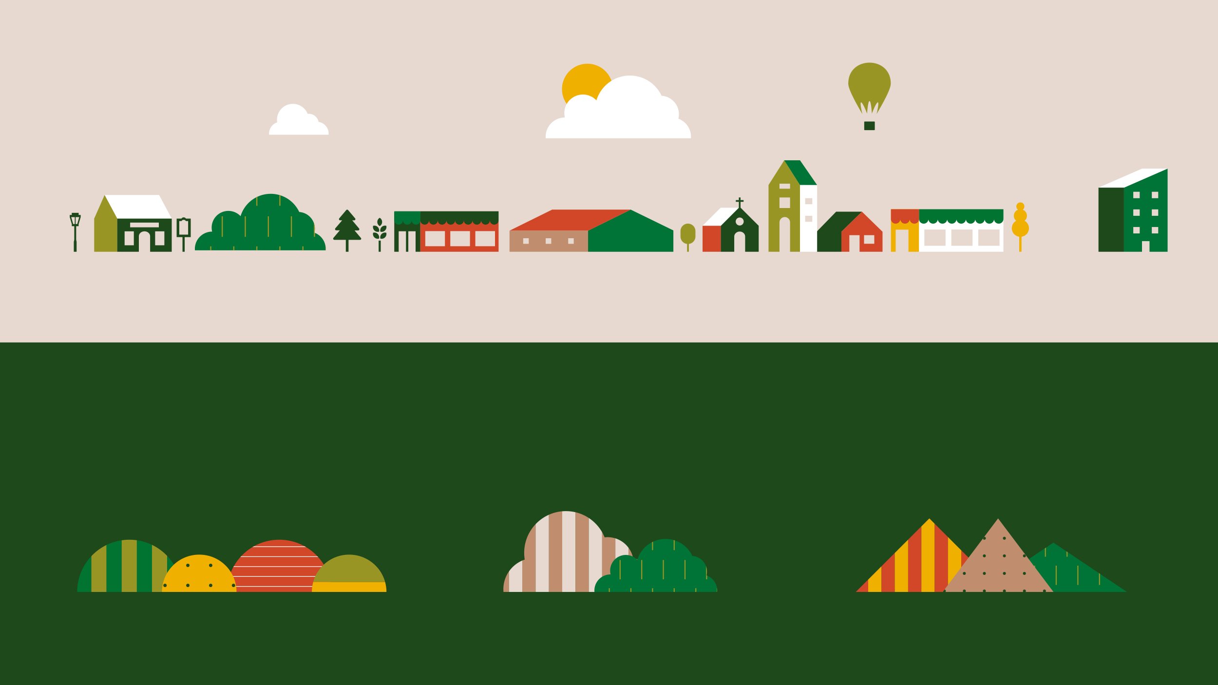
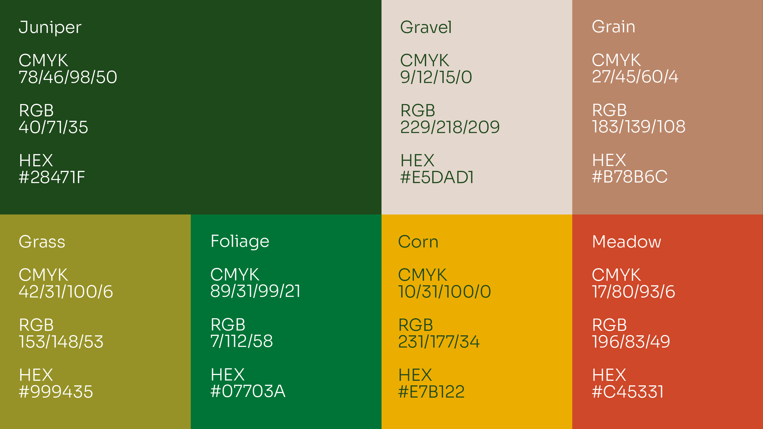
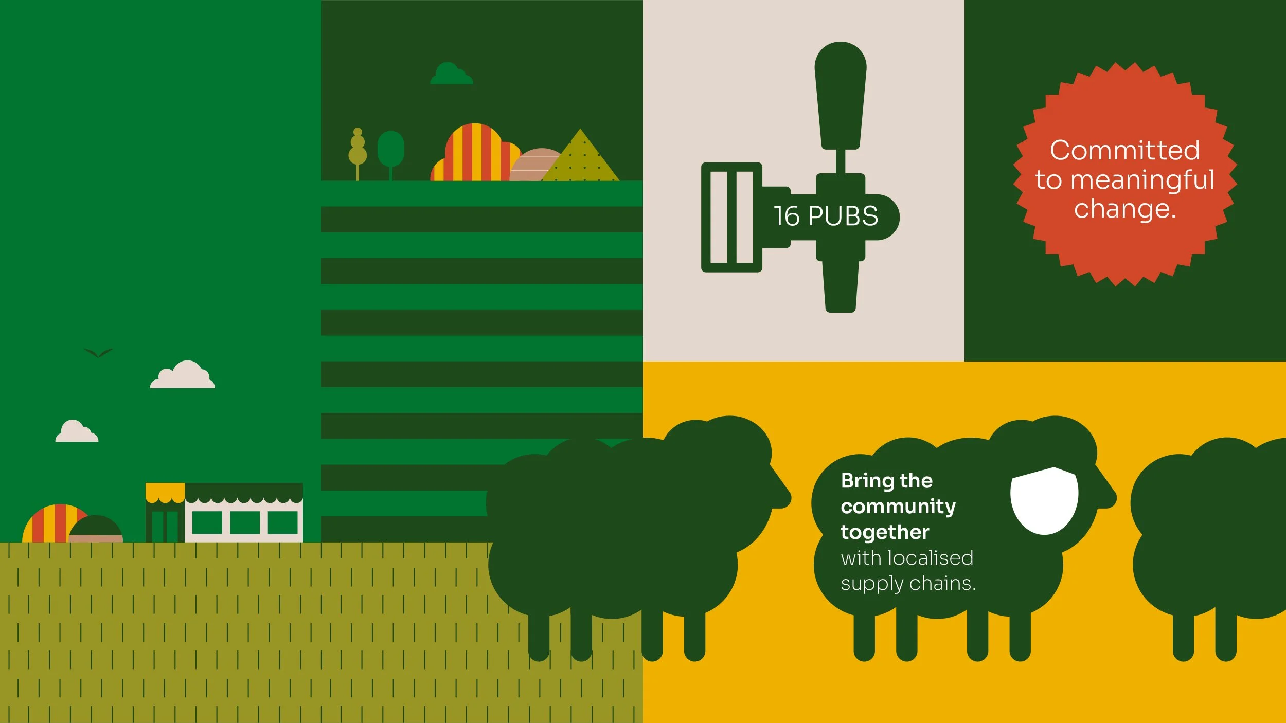
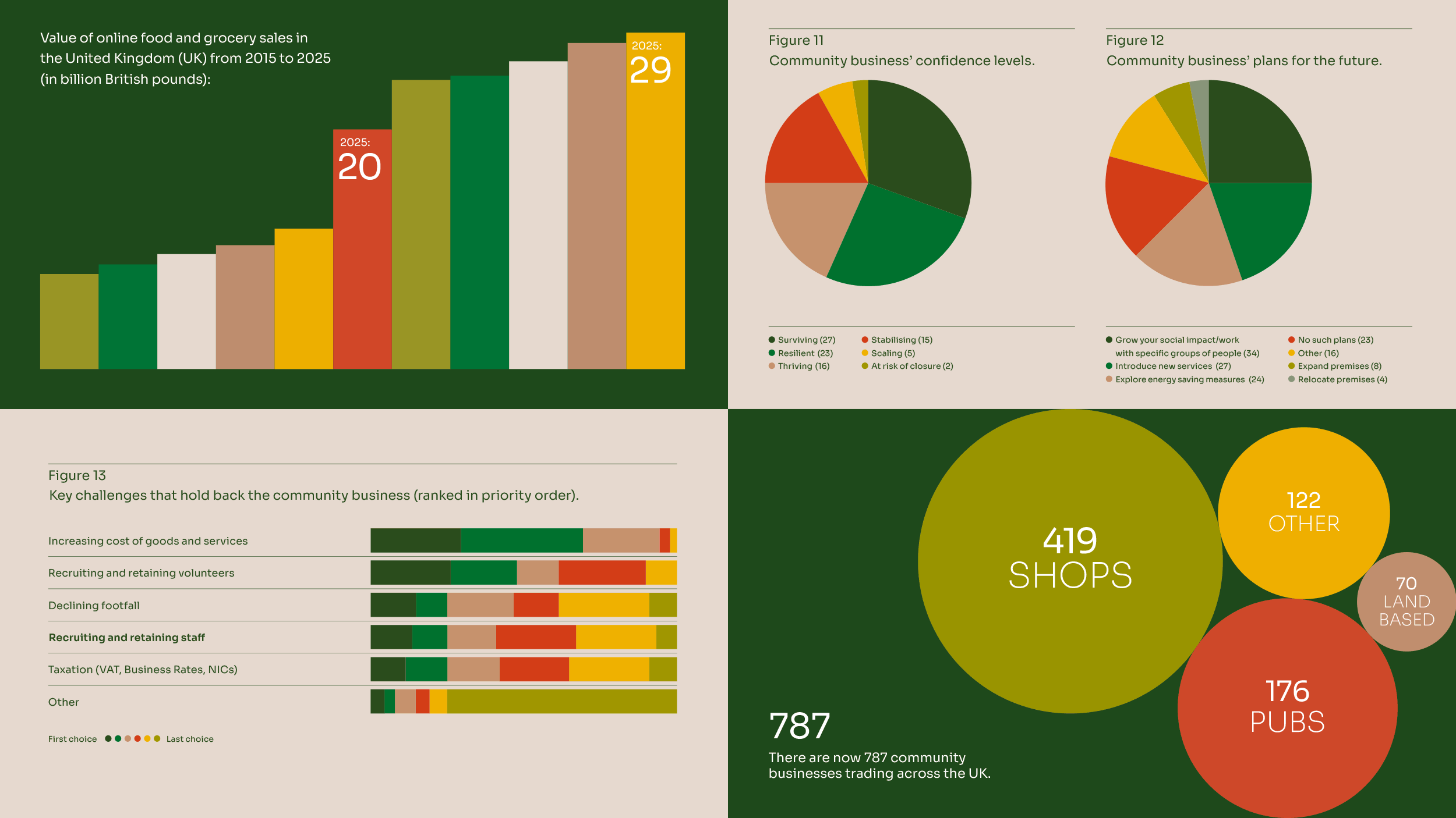
We created a new iconographic language influenced by the leaf marque. This was especially important because iconography plays a major role in how Plunkett explains complex issues, communicates sector data and brings statistics to life. Geometric illustrations, rural graphic patterns and a more balanced, confident rural-inspired colour palette complete the system.
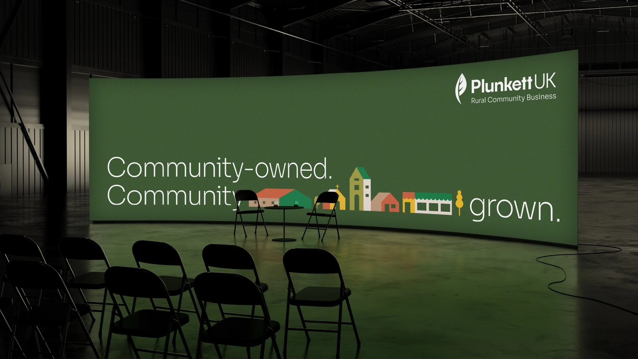
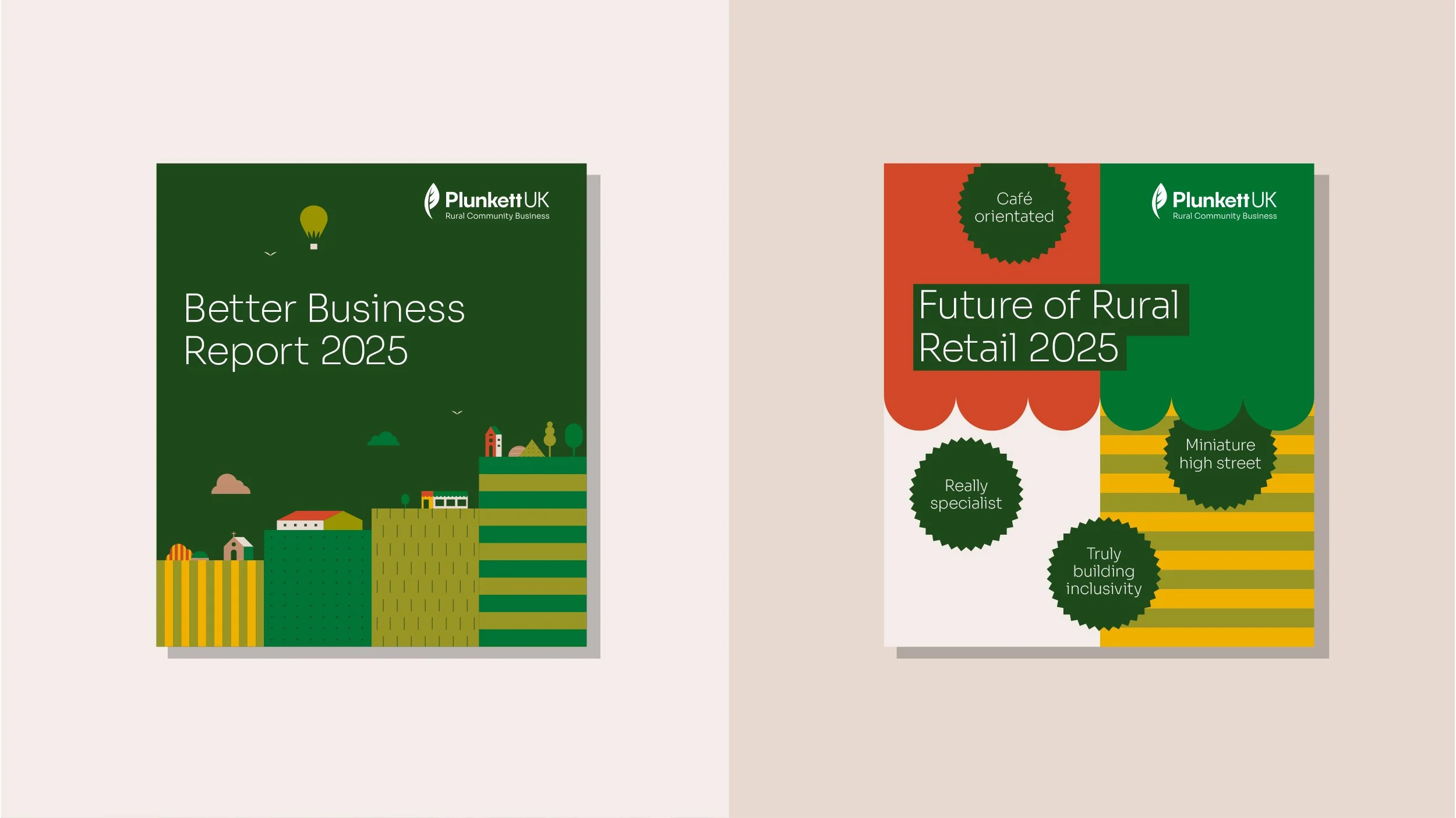
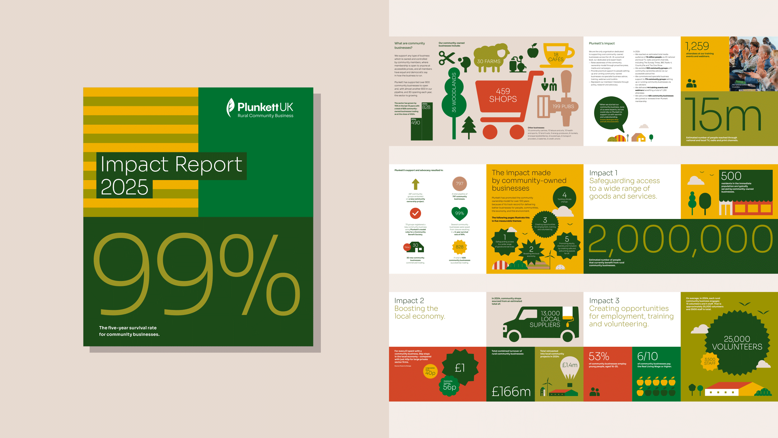
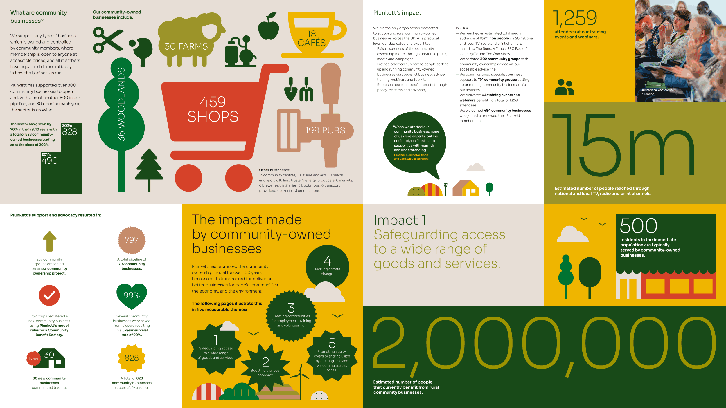
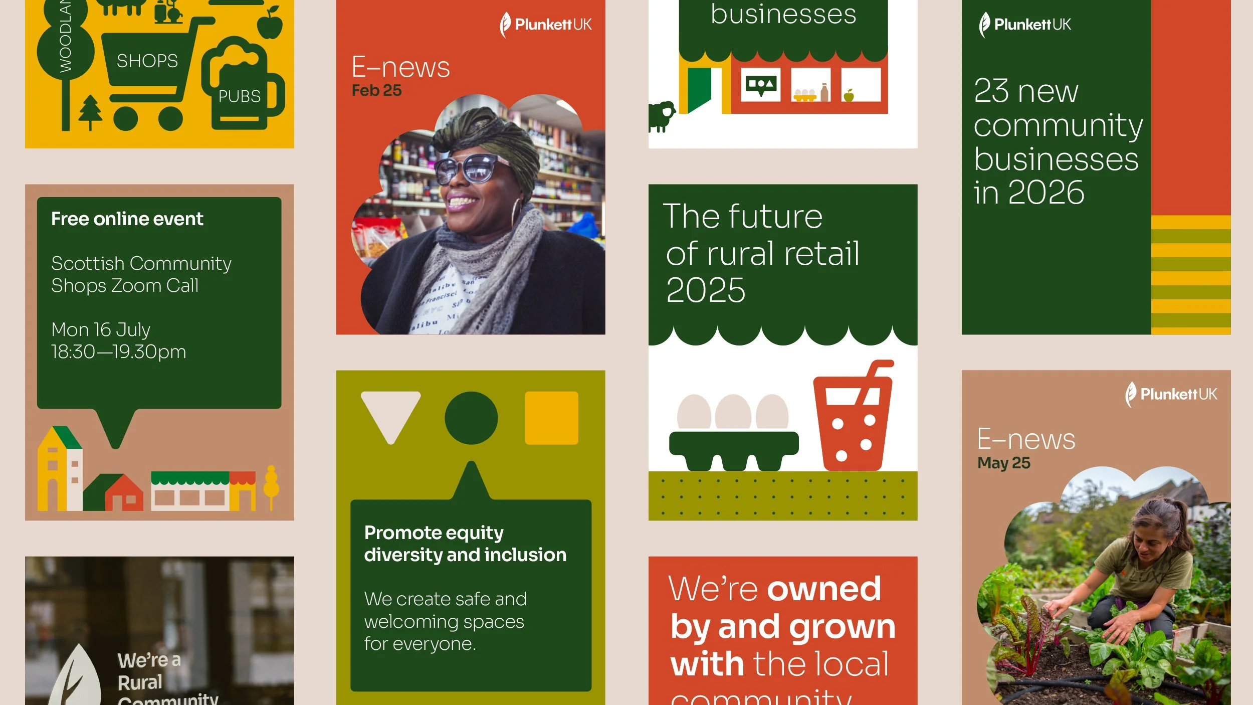
The new identity was designed to elevate Plunkett’s communications, helping them feel more professional, engaging and confident across every touchpoint. It gave the charity a stronger presence, one that could sit comfortably alongside major partners and collaborators, while still being easy enough for the internal team to use themselves. A clearer, more straightforward tone of voice runs through the design system, helping explain complex issues, communicate data and tell Plunkett’s story more consistently.
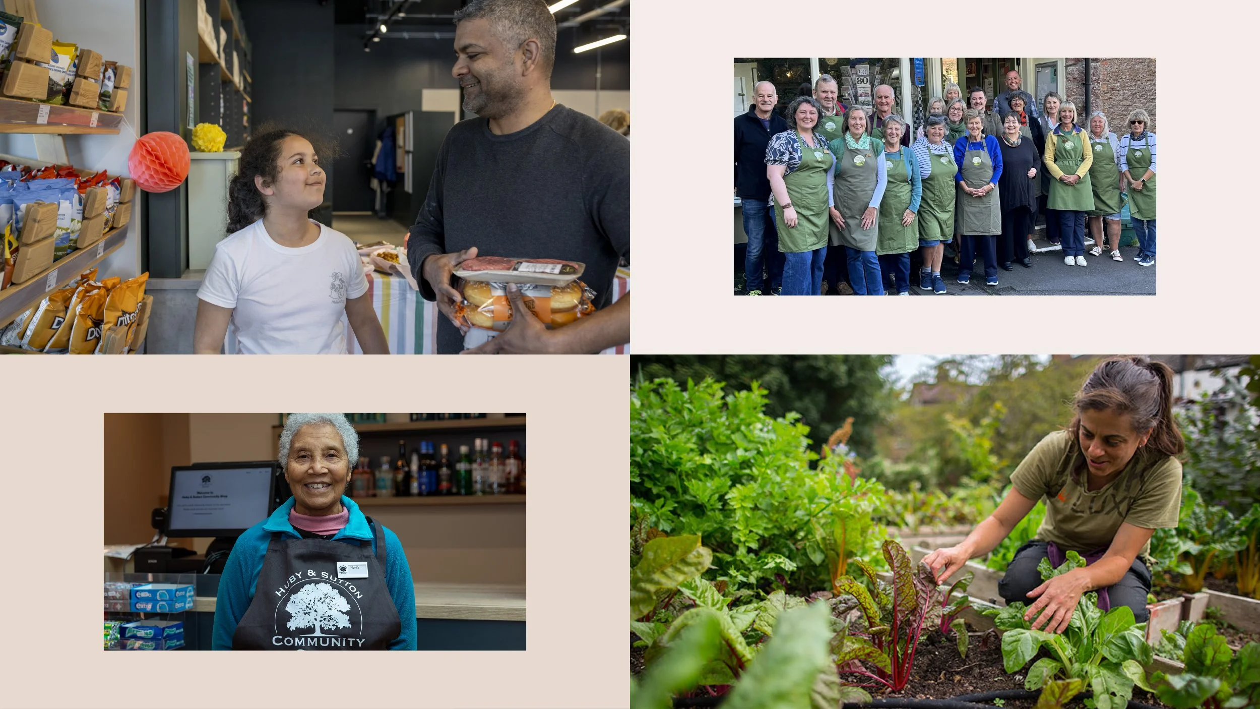
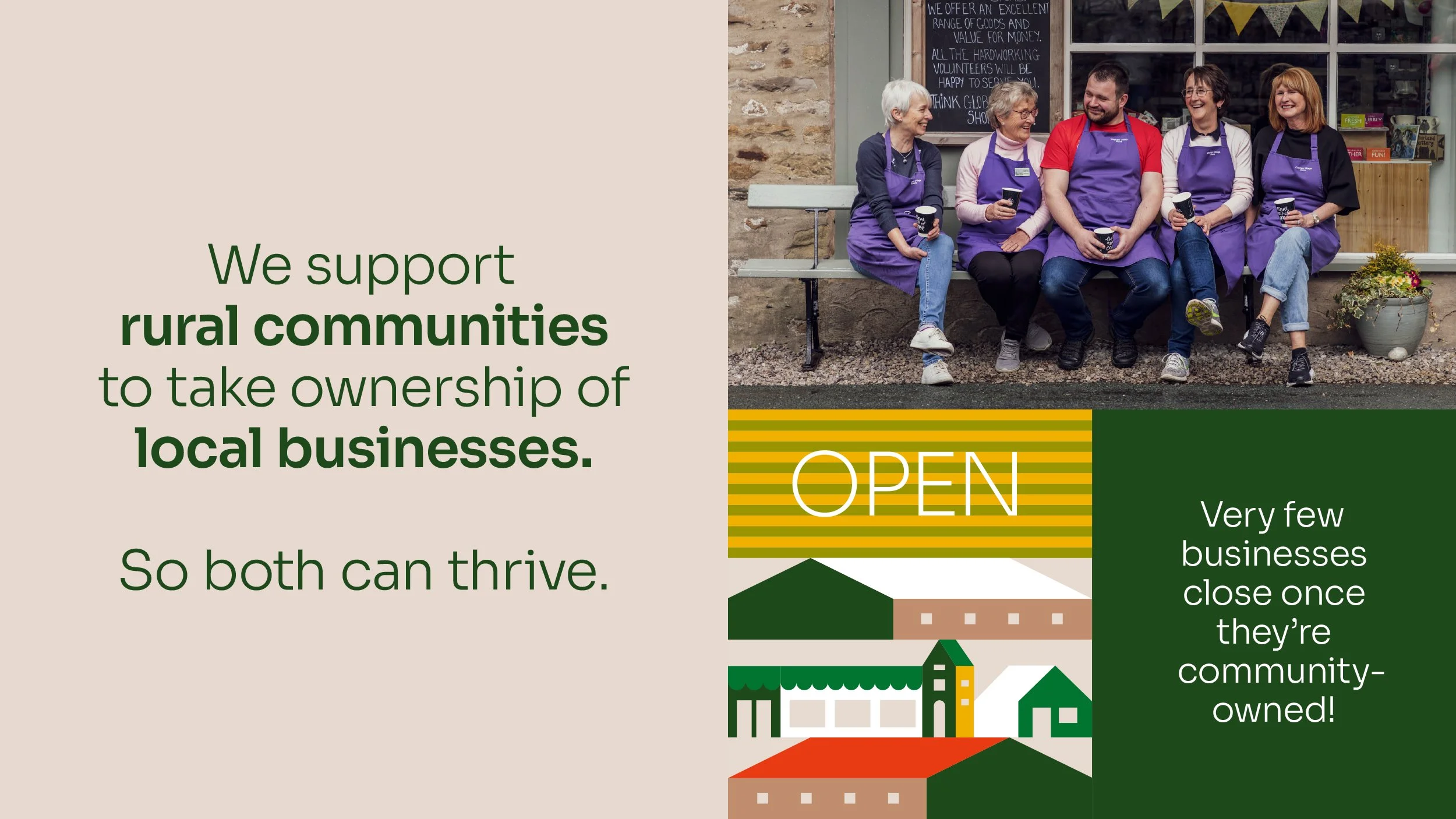
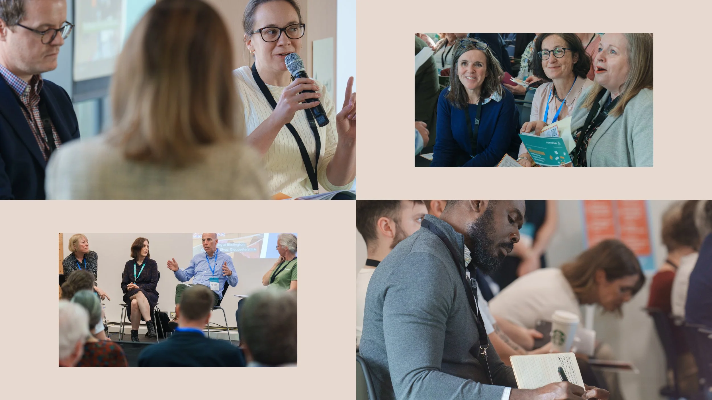
Photography was another important consideration. With limited budgets and little scope for professional shoots, we helped Plunkett make the most of the varied quality of images available, selecting, editing and composing them more carefully to create a stronger and more consistent visual impression.
Plunkett now has a brand system that is both practical and distinctive. A brand the team feels proud of and motivated by, because it reflects who they are, supports what they stand for and helps them move towards their goals.